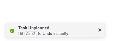
The confirmation window appears to much
The confirmation window that appears on the bottom left of the screen when for example deleting a task appears to much in my opinion (and I would keep it out completely)
Please authenticate to join the conversation.
Upvoters
Status
Not reviewed
Board
📥 Feedback
Date
Almost 2 years ago
Author
robbe@lamaire.be
Subscribe to post
Get notified by email when there are changes.
Upvoters
Status
Not reviewed
Board
📥 Feedback
Date
Almost 2 years ago
Author
robbe@lamaire.be
Subscribe to post
Get notified by email when there are changes.